I apologize in advance for what I am about to show you. I actually think my nails look hideous which sucks because I was really looking forward to using this yellow polish. I’d like to say that I do like the yellow polish on its own, but the stamp just looks…barf-worthy. My third submission for the 31 Inspired Days of Nail Art is a big fat fail. Here we go….
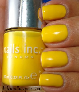
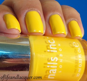
This is Nails Inc. Carnaby Street:
It’s no secret that I love Nails Inc. because they have the best creme formula on the planet as far as I’m concerned. Unfortunately, Carnaby Street fell prey to the usual trapping of yellow polish: it was patchy and kind of annoying to work with. It took 3 coats for me to be able to cover up all the bald spots which is unheard of in my Nails Inc. experience. I should have left well enough alone, but noooooooooooooooo. I had to stamp over this…
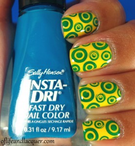
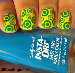
I used a design from Cheeky plate CH 48. While the design isn’t ugly, per se, the color combo just looks UGLY. Please join me in hating this final look.
I’m late to posting this because I went nuts and removed this immediately: that’s how much I hated it. I guess I can’t always have a nail win.
Don’t forget to check out the looks created by the other ladies participating in the challenge. I’m sure their submissions will be much more interesting–can’t be as ugly as mine…that’s for sure!
Thanks for stopping by and until next time!


I would love to join you in hating this final look but I just can’t. It’s not my favorite but mostly just cuz the stamping didn’t cooperate fully. I love the yellow polish so much tho that I’m torn between being mad the stamping covered some of it up and happy that I even got to see such a lovely yellow. F those sprinkle polishes. I want this yellow!
You might still be able to get it at Sephora. It’s been in the sale section for eons so I got it for $5. I think the stamping just killed it for me. Ugh…that color combo just looks horrid. I will say that I did like the yellow polish quite a bit despite the application issues.
I’m sorry to say it, but your fail makes my fail feel a little less horrible, yay for commiseration! I’m just glad I’m not the only one who hated this. lol Your blue stamp didn’t stand a chance, it went right to green! I thought Insta-dry polishes stamped more opaque than that?
What I did is that I actually mixed a Konad green polish with the blue Insta-Dri. Why? I have no idea. I’m just a tard sometimes. I don’t like it at all….neither the pattern, the color nor the stamping transfer. I think that any time I use the cheeky plates, I am going to be reminded of how much I hated the process of getting them. My Cheeky stamps are going to taint all future nail looks that they come in contact with. hahaha!
Yeah, what’s up with all this Cheeky bs? I didn’t order them because while I like a few stamps A LOT, most of them I didn’t care for. And to hear that it took ages to get them is redic too.
I guess mixing your stamping polish would make more sense why its so green! Green and yellow are hard colors to work together, they can clash so easily. This pattern instantly made me think of Target… on Earth Day. lol
Honestly, I am really regretting purchasing this set. There are other stamps that are interesting in this set, but I don’t know if I can wear them because they are so juvenile. I think I like geometric patters and the like…not so much item images and such. And yes, the stupid shipping really killed it.
You are sooo hard on yourself and your manis its nutz! Although i dont LOVE this mani its certainly not terroble, you have amazeballs stamping skills and i like both of the polishes, its very bright thats ll. lol love it either way, always do
I know! lol I just always want everything to turn out perfect and when it doesn’t, I get so mad at myself. As I said previously, I do like the yellow but I still hate the stamping and the color. It just looks muddled. 🙁
I love it personally.
Thanks. I can agree that the yellow is nice but not the rest. 🙁
i actually quite like this! it’s quite retro!
It does have a retro feel to it now that you mention it! I still wasn’t sold. I felt bad that I ruined my pretty Nails Inc. 🙁
I actually love them! They remind me of the Toys-R-Us giraffe bubble gum that I used to love. Great designs for girls
LOL!!! I love it when things bring back childhood memories like that. I think that you hit the nail on the head with these cheeky plates: They are great for girls….not so much for 32 year old women. hahaha
Cynthia recently posted..Cosmetic Arts Nail Polish
I actually kinda like the final look! Probably would drive me nuts if I was wearing them, but I think they look neat! Either way, I love that stamping plate and yellow polish!
You have no idea! lol My nails were so gross and distracting and that is exactly why I couldn’t leave this look on. I barely managed to take a few pictures before running for the acetone and cotton. I wish I hadn’t messed up the pretty yellow polish in the end.
Cynthia recently posted..Cosmetic Arts Nail Polish
That yellow polish is so pretty! such a shame it was a pain to work with! i don’t own any nails inc. polishes although i really, really, really want some sprinkles. I like the stamping, but i think it would have been so much more kick butt if the polish didn’t turn green. That must be because the base was so freaking kick butt of a yellow polish. I think your stamping skills are amazing though, everything is placed perfectly!
Awww! Thank you.
I agree that this polish is pretty awesome. I have three of the Sprinkles polishes and I have only used one so far…if that isn’t the sad state of over-purchasing, I don’t know what is. In fact, I don’t think I’ve used half of my Nails Inc collection. Ghhhaaaaaa! Must swatch them soon, at least.
Cynthia recently posted..Cosmetic Arts Nail Polish
It reminds me of Sundrop soda 🙂
Ergh I have the same problem with yellows- strangely enough, my go-to yellow is by Kleancolor. Sometimes cheapo polishes are glorious!
LOL!!! I had to look up Sundrop Soda to make sure I remembered it correctly. You are so right…the colors are so similar.
I have tried really hard to like Kleancolor. I am not a nail polish snob in the least (since I am such a Wet N Wild whore–wow that sounded bad!), but I hate Kleancolor. HATE IT!!! It seriously smells like rotten feces rolled in vomit when I wear it. I know other people have complained about the scent, but it never goes away on my nails so I just can’t wear it. I guess Kleancolor and I just don’t mesh well together!
Cynthia recently posted..Cosmetic Arts Nail Polish
i didn’t hate it… it just look too normal for being in a challenge.. it reminds me of the brazil flag…!
I totally agree…too ordinary for a challenge look and now I am totally seeing the brazil flag on my nails. hahaha!
Cynthia recently posted..Cosmetic Arts Nail Polish
hahaha maybe you could have pimped out using rhinestones or another color on the circles..!!
mariaemmafaria recently posted..Dotting Nightmare
I think this is the most “yellow” yellow I’ve seen! Not orangey or mustardy…just straight canary yellow! And $5!!! Although 3 coats is unusual for Nails Inc., I think it was worth $5!
I don’t *hate* it…I just think it’s a little busy. I was also reminded a bit of Target.
Yes…it really is YELLOW and a major steal. I am always scoping out the polish sales at sephora. I just spent a freaking hour perusing the site, adding crap in my cart and then closing the browser. I am kind of proud of myself. I don’t remember if it was you who mentioned that black and yellow song a while ago when I did my crash test dummies nails, but it so got stuck in my head right now.
It is a busy pattern and really gross colors together.
Cynthia recently posted..Cosmetic Arts Nail Polish
I *hate* that song, so it was probably not me.
Now I have that Crash Test Dummies song “Mmm mmm mmm mmm” from the 90s in my head!
I like this…
i feel bad that I do because I know you said to join in hating this LMAO!!!
I even like the little stamps! I like it!
siobhan recently posted..31 Day Nail Challenge – Day 26: Inspired by a pattern
LOL…it’s ok. I still don’t like it. 😛