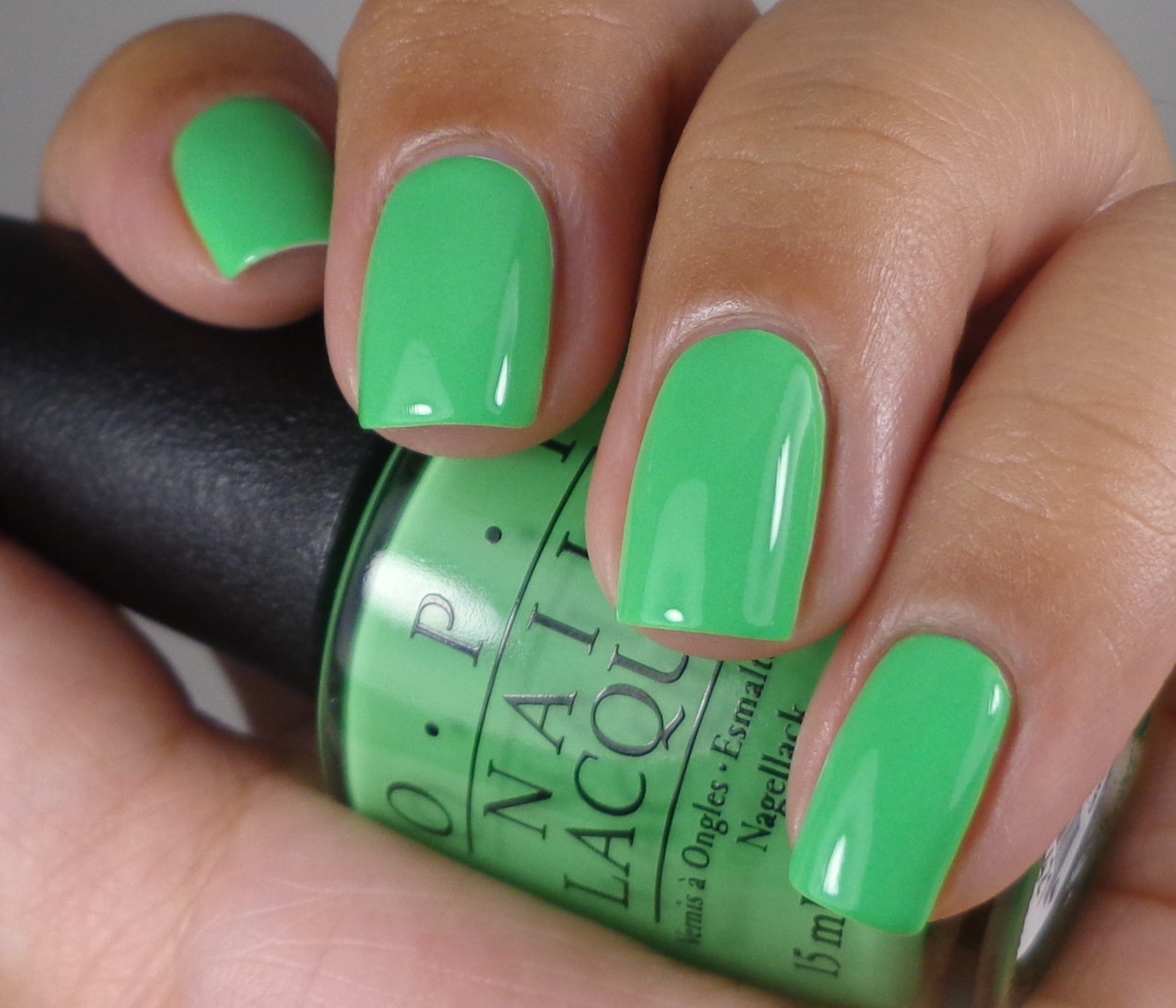
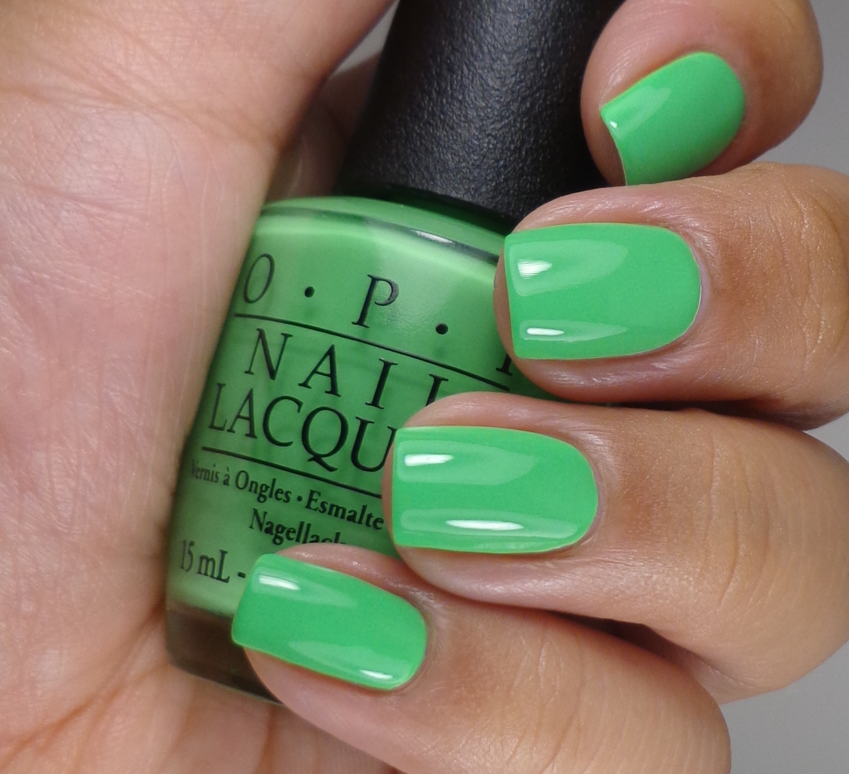
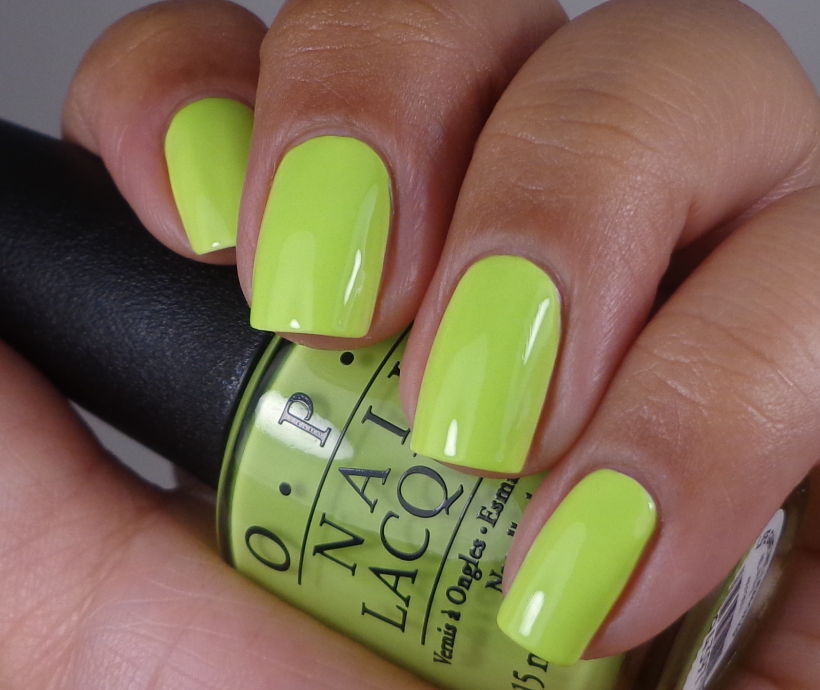
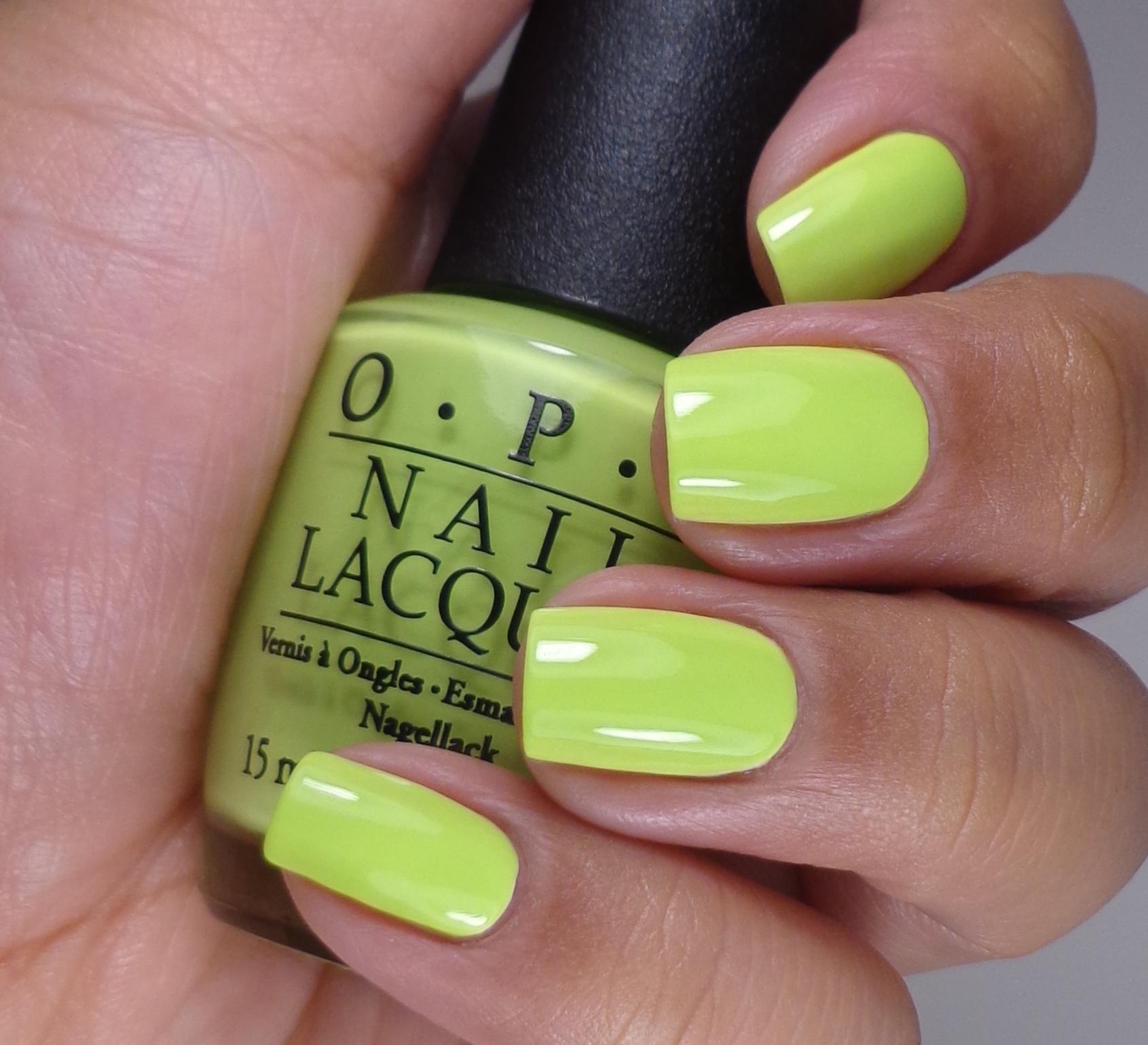
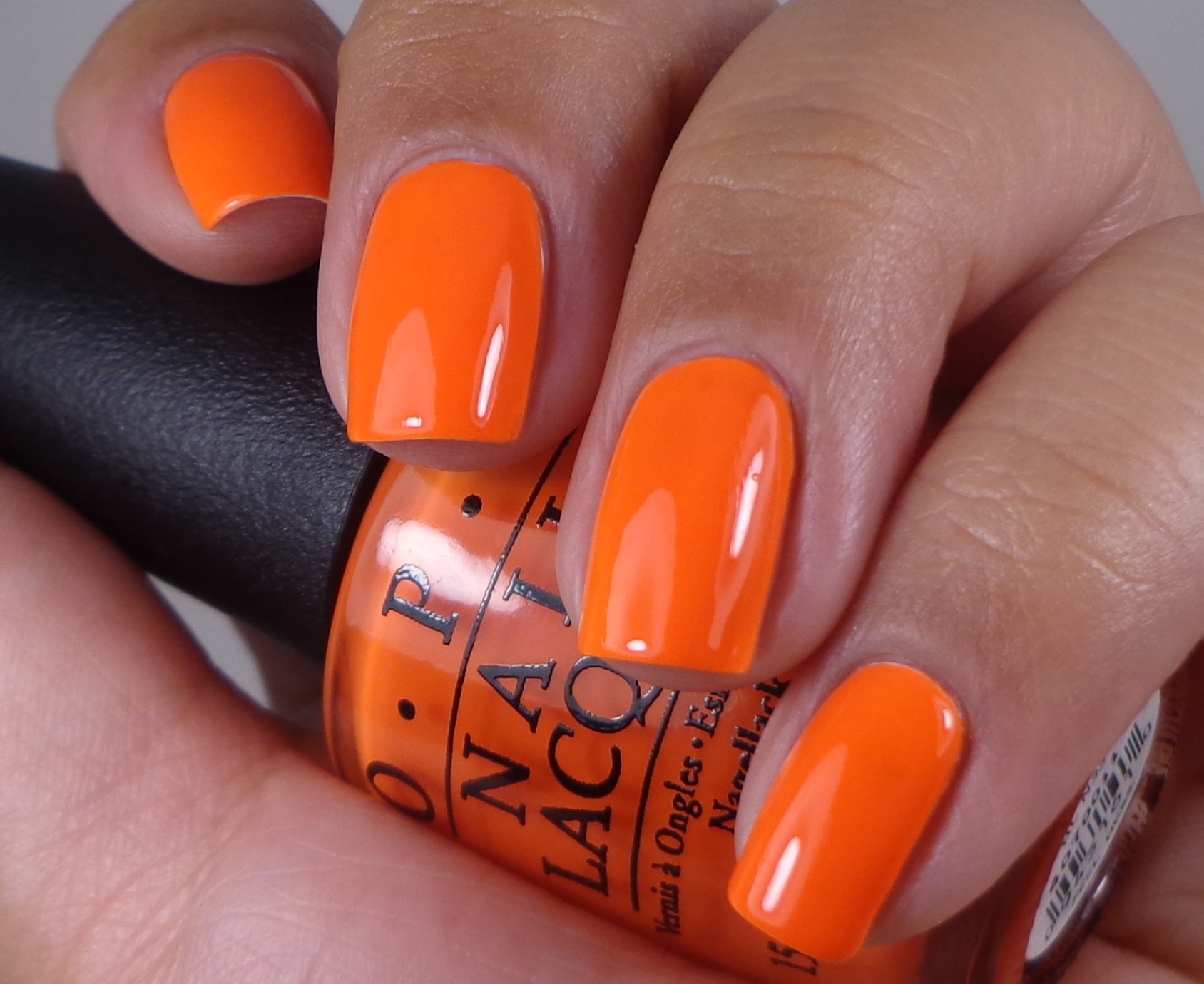
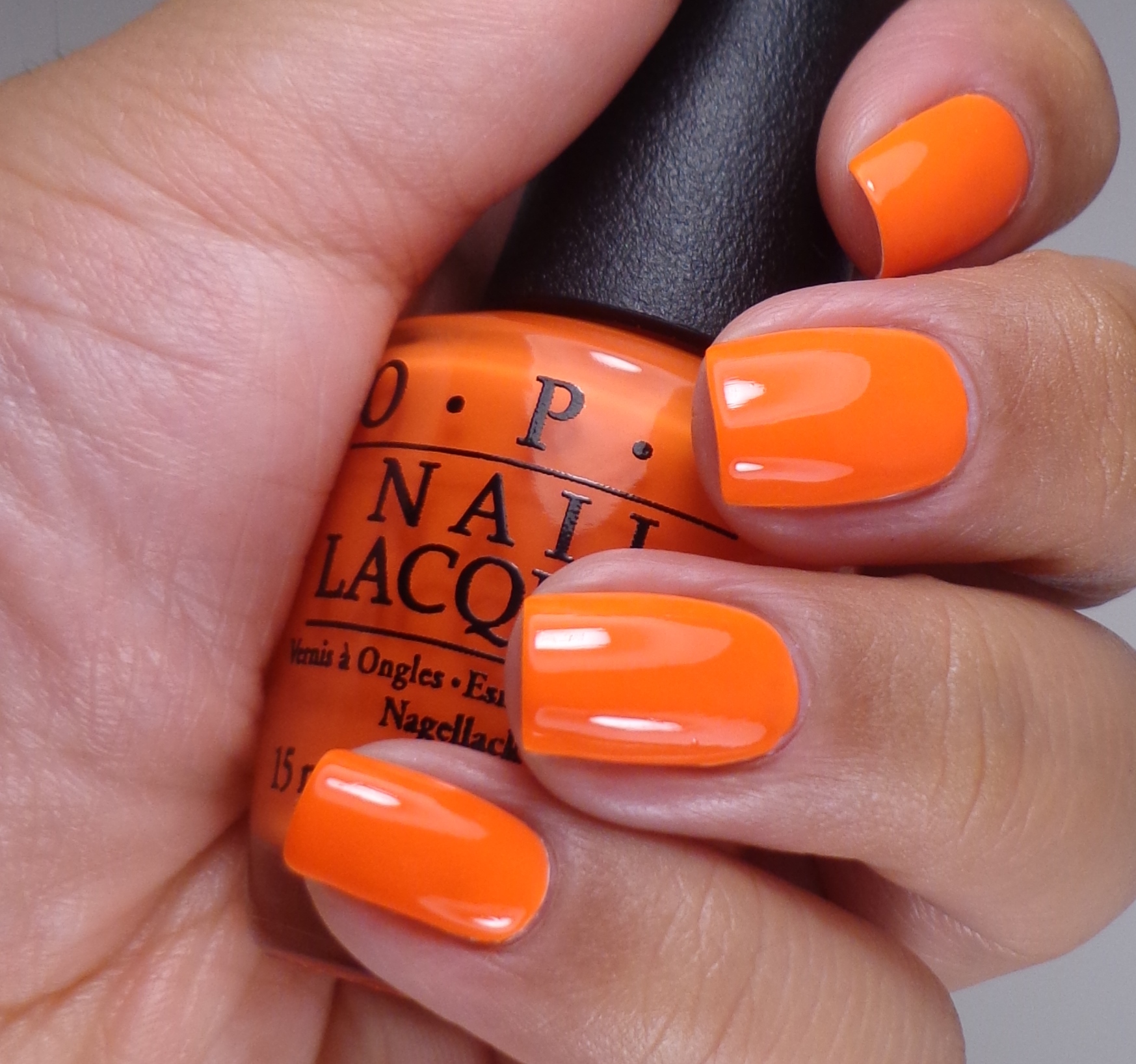
One of the only things–if not the only thing–that I love about Summer is the fact that we see tons of color everywhere and I’m not just talking about nail polish. Every Spring, I get giddy seeing previews of juicy Summer Collections and this year has been no exception. When I first started hearing about an OPI Neons Collection, I was very excited. Excited is not really the right word because I was going apeshit crazy for them. I don’t like to necessarily say that I have obsessive qualities in my personality, but you can definitely qualify my polish idiosyncrasies as such. Now, I do have to tell you that while I love bright neon colors, I definitely do not like neon formulas. I cannot stand the idea of 3+ coats of polish, and I just about lose my shit when I am told to use a white base under a polish. Do you understand my conundrum? For this review, I decided to follow OPI’s inscructions and used their Put a Coat On! white base coat which they state will further enhance color and basically make them pop. Look at me: following directions for once. Let’s take a look at my swatches before I break it down for you.
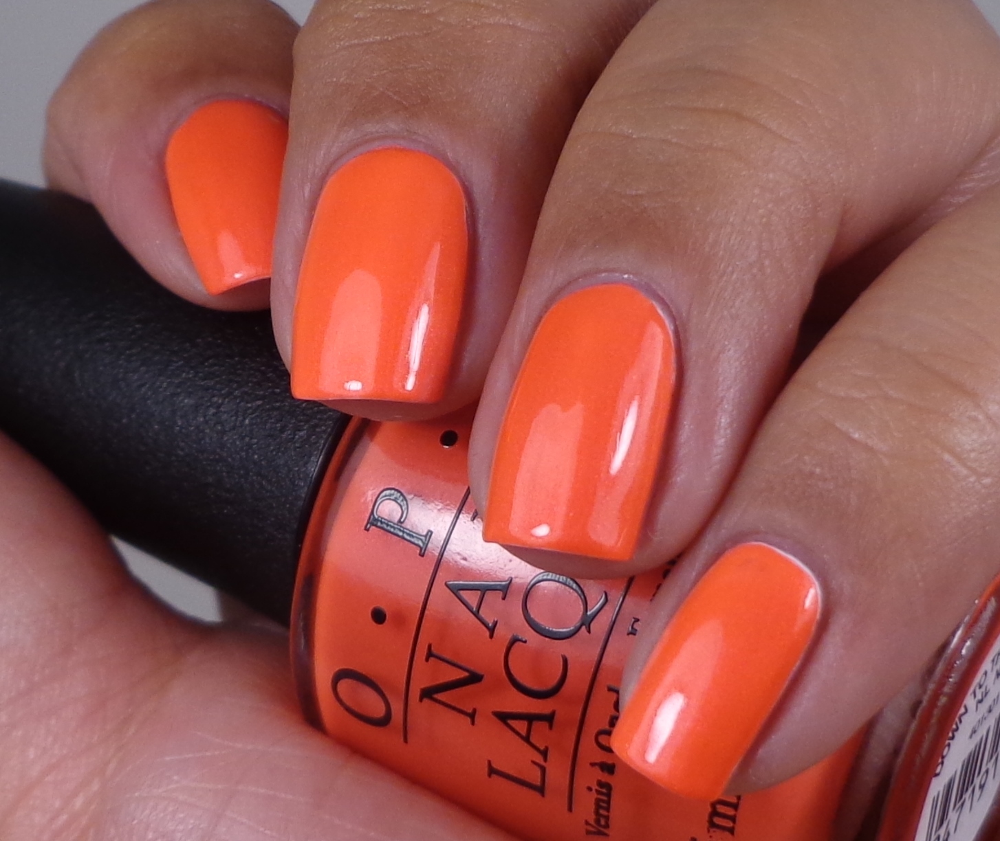
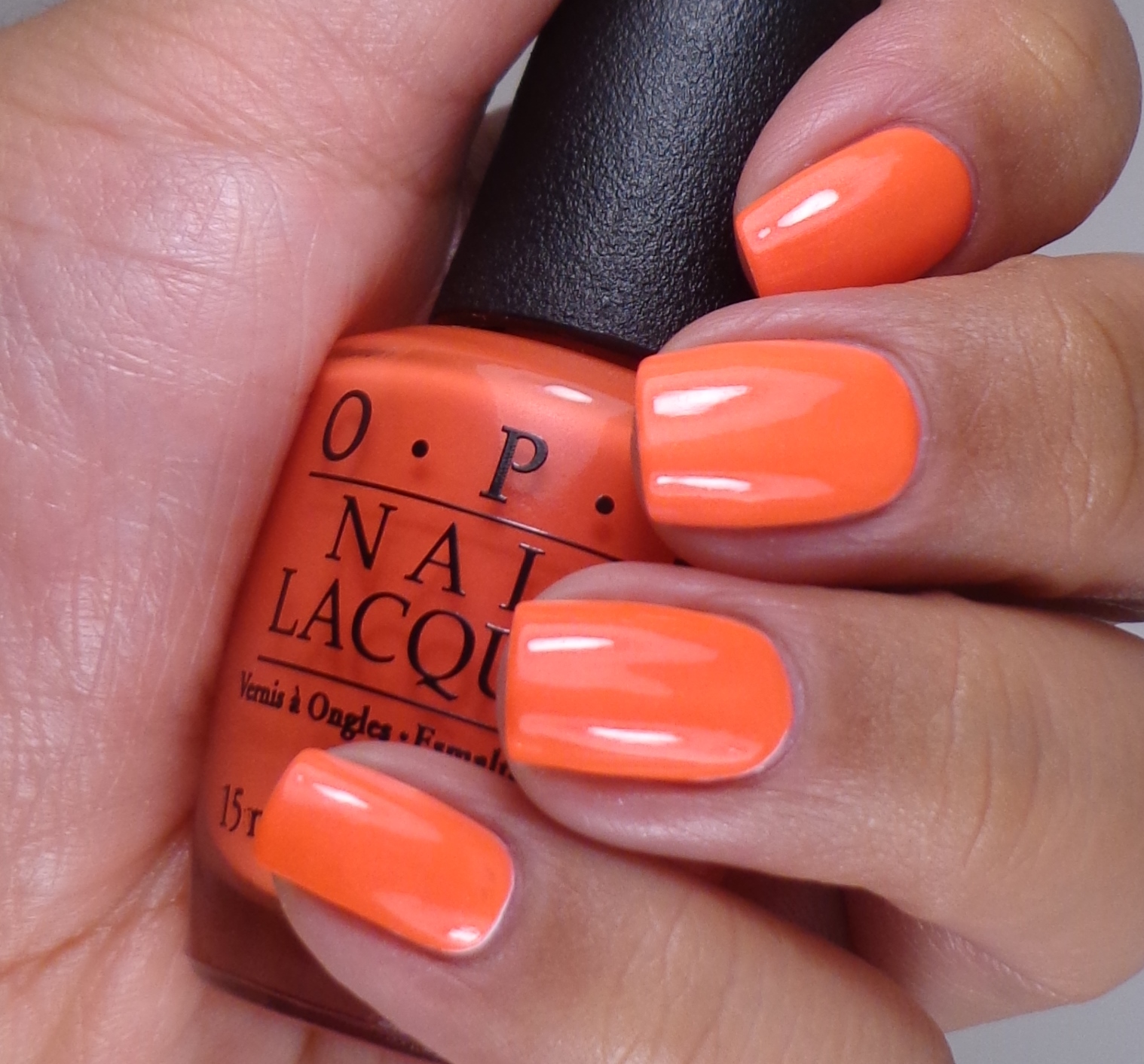
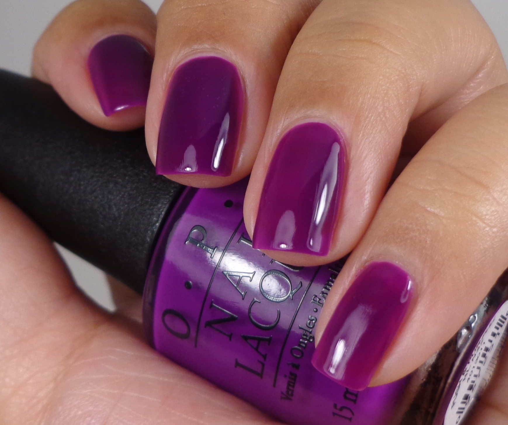
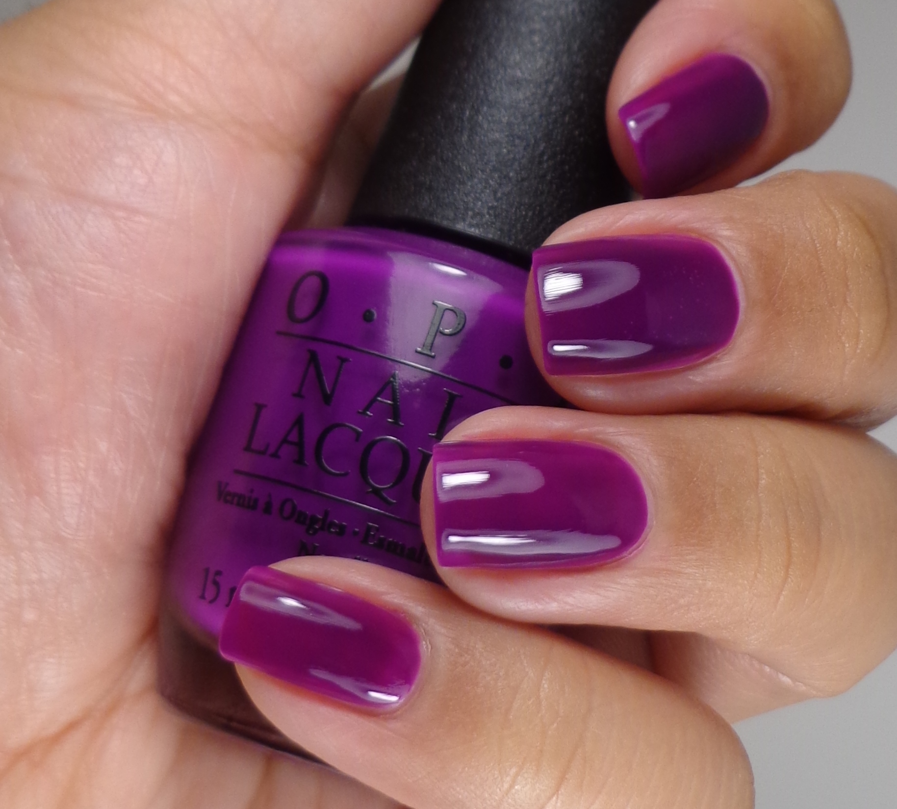
Am I the only one doesn’t really see true neons here? Well, I shouldn’t say that because Life Gave Me Lemons is kind of electric. Other shades are very neon-esqe, but I was expecting something more retina-searing. Let’s get the ugly out of the way first: Push & Pur-pull, you are a beast. This polish was basically unmanageable. When I applied it over the white base, it never looked good. I applied 2 coats of the white base and 4 coats of Push & Pur-pull hoping that would make it look nice. NOPE. You may be thinking that I over-applied it, but I actually went really slowly and let each coat dry before making the decision to add another and another and another. Finally I took it all off and applied it without the white base coat which is what you see above. I am still not happy with it, but I would highly recommend that you skip the white base with this one. As far as the other 5 polishes are concerned, they weren’t horrible but they weren’t that nice either. Out of the collection, Life Gave Me Lemons had the best formula and coverage. For all of my swatches, excet Push & Pur-pull, I applied 2 coats of the white base and 2 coats of polish which I ten top coated with Seche Vite I am not a huge fan of the satin finish that most neons carry which is why I always Seche Vite the crap out all my manis. When did Seche Vite become a verb?
Let’s talk about the Put A Coat On! base coat…
 Yep, hated it. It is the strangest white polish I have ever used. It’s chalky and strange and it felt like it never dried. When I applied polish over it, it kind of came off and would get runny. It was just weird. Also, can I tell you how much I hate that no matter how hard I tried, I can see some of the white peeking out around the edges of my mani? It’s a huge pet peeve of mine so it’s driving me nuts that I’m posting what I feel are sloppy swatches. If you are able to apply the white base in one swipe, then you don’t need more than one coat. If you need to make a second pass, then you’re going to get a streaky mess which is why I applied 2 coats of the white base.
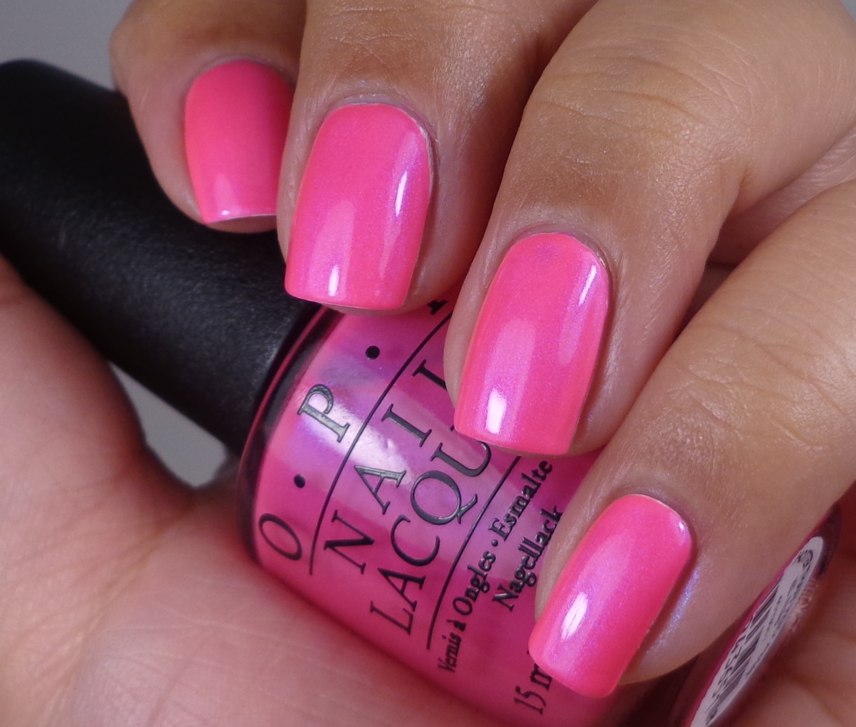
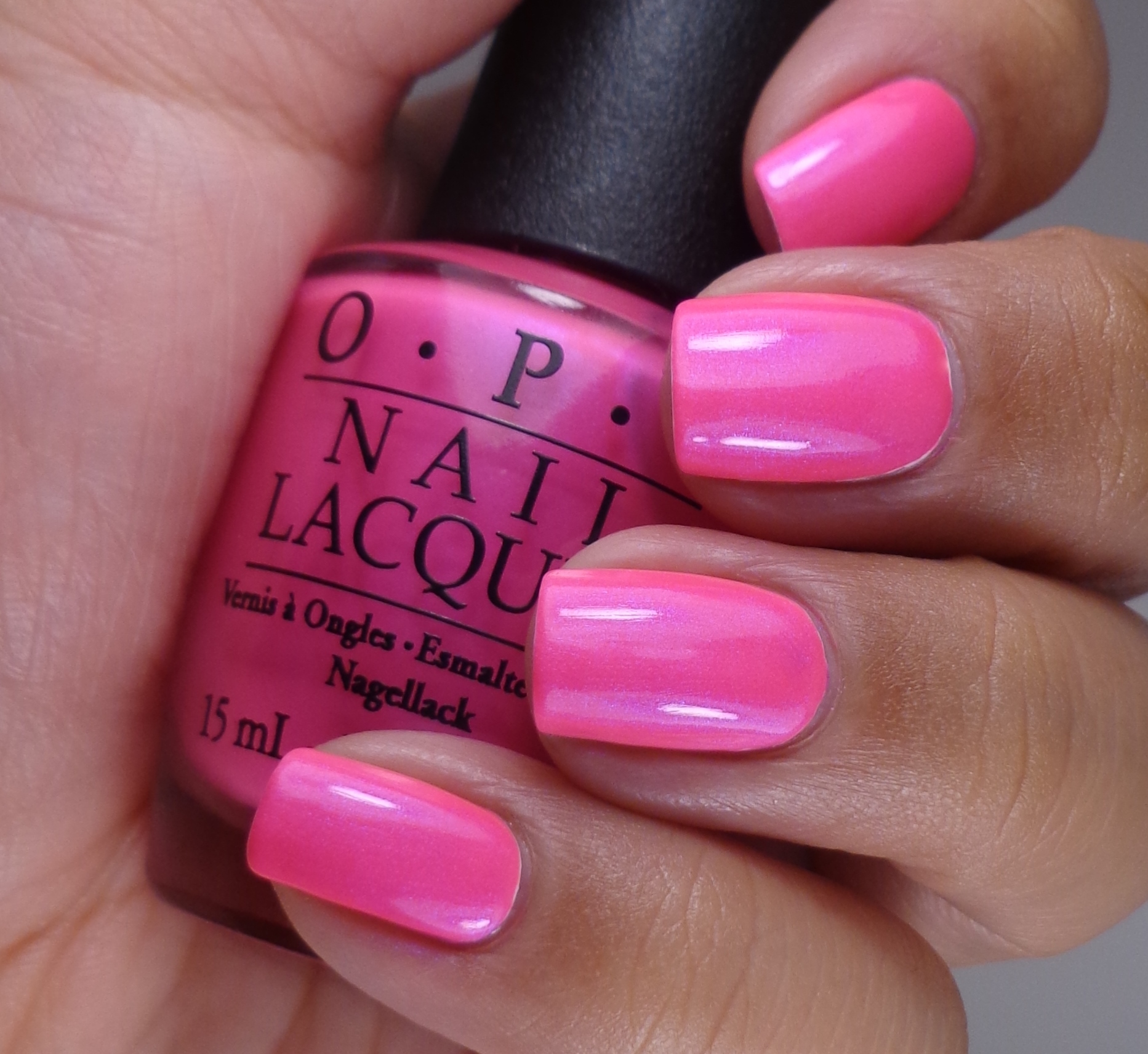
Overall, I’m not diggin’ this whole collection. The three that I really like are You’re So Outta Lime, Life Gave Me Lemons and Hotter Than You Pink. Hotter Than You Pink is much brighter in real life than my pictures show and it has some beautiful shimmer to boot. I’m so conflicted because I wanted to love this whole collection so much and now I don’t. The OPI Neons Collection will be available this month and will retail for $9.00 ($10.95 CAN) at Professional Salons, including Beauty Brands, beautybrands.com, Beauty First, Chatters, Dillard’s, jcp Salons, Pure Beauty, Regis, Trade Secret, ULTA and ulta.com. What do you think of this collection? Will you be picking up any of these shades for the Summer? Thanks so much for stopping by today, and I will talk to you soon.
P.S. Have you entered my giveaway for a set of the OPI Sheer Tints? Come enter here.
Love the OPI Push & Pur-pull 🙂
I like to color but the formula is so bad I can’t love it. 🙁
Cynthia recently posted..KBShimmer Summer 2014 Collection
Yeah, I don’t know why this is a recurring problem, but it seems like every time a brand sets out to specifically release a neon collection, the colors are not neon at ALL. Legitimate neons are available in the core line of plenty of brands – LA Colors has a good neon orange, Kleancolor has a great neon orange, pink and yellow (their purple and blue are too dark to be neon, the green is okay but I think it’s a bit too dark as well). Sinful Colors also has a pink called 24/7 that seems a bit light in the bottle, but it’s far more neon than even Kleancolor’s neon pink, and more opaque too, so it’s become my go-to neon pink. I think the only neon colors I haven’t been able to find good versions of are blue and purple. The blues are always too dark or too dull (related: does anyone have any recommendations for a TRUE cyan polish? all I can find are light teals that are basically just dull Tiffany blues). Then the purples… they are always WAY too dark.
The purples I see most often being called “neon”, even by bloggers, are Sinful Colors Dream On and Zoya Charisma. I have a color spoon of Charisma because I didn’t want to buy the whole bottle and wind up disappointed, and I’m glad I didn’t. I do own a bottle of Dream On, though. They are dupes, honestly. They look ridiculously bright in the bottle, but once you put them on and they dry, they become incredibly dark. Putting it over white doesn’t really help, because it winds up being too streaky, and if you add more to avoid streaks, you just wind up covering up the white and it gets too dark all over again. The thing I find most frustrating about these two particular polishes is that nearly every single swatch I see of them (from BLOGGERS!) is completely wrong and not even close to accurate… like, they Photoshop it to make it look like the bottle color is what really shows up on your nails. I don’t understand why a blogger would do that. It makes me want to do a totally honest post on them to clear it up, but I’m not really a swatcher, I just do nail art.
Gah, sorry. As you can see, the whole “neon polish” thing is a very sore spot for me. I am a super colorful person (I even had rainbow hair for a while), and I love neons to bits, and of course I’m a polish addict, so the fact it’s so difficult to find truly neon polishes is beyond annoying. 🙁
I don’t think bloggers are purposely changing the color to dupe people…some colors are just too hard to photograph. I have some problems with teals and how my camera photographs them but I never do any color correction on my pictures. The only thing I do to my pictures is to crop them. I think neons are just hard to photograph in general. I think that neons for me don’t get better than the China Glaze Poolside Collection. When I hear companies are putting out neon collections nowadays, I think I am only expecting bright and not neon colors.
Cynthia recently posted..KBShimmer Summer 2014 Collection
Ah, I didn’t mean to imply that they’re purposely duping their readers… I just mean I find it strange that so few of them attempt to color correct their pictures, especially when the swatch is that far off. The Charisma/Dream On situation is the worst, IMO, because there is no way in hell a camera would have trouble capturing that color – the final color on the nail is very dark and not even remotely neon (actually looks similar to the purple in this collection, but more opaque and dries matte), and there’s no reason a camera would pick it up as being as neon as it looks in the bottle, so in that case, for whatever reason, people ARE editing their pictures to make it look like it is really that bright. Unfortunately as someone who loves bright colors this is a problem I run into way too often on blogs. Most blogs are fairly reliable when it comes to swatches, but there are a couple I’ve stopped following because their swatches were repeatedly incredibly inaccurate. Temptalia was probably the worst offender. Also, I love Base Coat Top Coat, but she edits her pics to make them quite a bit brighter and possibly more saturated, as I’ve been really excited by her Polish of the Week swatches a few times then went to buy the polish at the store only to find it wasn’t even close to being as bright as her picture showed. (L’Oreal Not a Cloud in Sight is the one that sticks out the most in my memory when it comes to having that happen with her blog – her picture made it look nearly cyan, but in reality it’s a dupe for ChG For Audrey, which is a lot more dusty and muted). I know most of these bloggers aren’t trying to screw with us, and I understand how sometimes cameras have trouble catching certain colors correctly, but some of these particular situations make no sense to me and it’s pretty frustrating (especially when I order a polish online based on a swatch by someone else, because I can’t get it in stores for whatever reason, and it turns out to be nowhere near the pictures – like OPI Eurso Euro, which most swatches show as a bright royal blue, but in reality is a dark, near-black navy blue that is actually indistinguishable from black in most lights).
Haha, sorry for the rant, it’s just that this happens way too friggin’ often and it’s a really big pet peeve of mine, especially when I wind up wasting money because of it. 🙁 I trust your swatches, though! 🙂 <3
I take that back. ibd has some crazy neons that are part of their core collection. I’ll be getting a few more of those (incidentally, ibd is made by the same folks who make china glaze)
Cynthia recently posted..KBShimmer Summer 2014 Collection
Try color club neons. Especially disco dress. It looks neon purple but becomes this bright but dark maybe it’s blue maybe it’s purple polish. Gets compliments
I absolutely love the green and the lemon/lime color. Not a fan of the pink, but the purple I actually like. I hate that it’s a shitty formula though. :/ Ugh. But I LOVE that you are completely honest. You save me so much money (that I spend in your blog sale lol).
Jessica recently posted..Finger Paints Rock the World Grunge Look
The lemon and green colors are the best, I think. Hey, you know I’m always all about the truth. 😉
Cynthia recently posted..KBShimmer Summer 2014 Collection
Yeah, I’m with you: what’s up with these non neon neons?? First Essie with basically a repromote of past successful colors under the guise of neon, and now this. And again, I am in total agreement that you shouldn’t need to use a white base for neons to pop. Come on, multi million dollar companies, but a little more R&D into making your formulas work.
Amanda @ Amandalandish recently posted..Zoya Tickled Collection for Summer 2014
I think Essie is going to keep recycling their “neons” every summer. I get that they are pretty, but they are not what they are advertising. These neons are bright polishes, but definitely NOT what people are expecting. Ahhh…makes me sad.
Cynthia recently posted..KBShimmer Summer 2014 Collection
Those are nice!
Lisa N. recently posted..Memebox Luckybox #3 Unboxing
They are nice–just wish they were brighter.
Cynthia recently posted..KBShimmer Summer 2014 Collection
I just bought the mini-collection for one friend for her birthday. hgrr..
She’s the other girl behind mynailsdiary.
the thing is that IDK how she does, but she never complains about polish formulas like us!
do you know when we keep complaining about streaky one.. not a problem for her. she really knows how to get the best from polishes, so I’ll keep you posted on how these polishes behave in her hands.
LOL! I am very curious now so definitely let me know what she thinks.
Cynthia recently posted..KBShimmer Summer 2014 Collection
i was happy when i bought it, but now i’m just plain angry with my bank..
it seems that my credit card has been blocked since november (i haven’t bought anything since that time), IDK why it was blocked, the bank doesn’t know..
so they couldn’t ship it on time .. i just bought again and when I wanted to see if one day shipping was available.. the cost was $25..
from ZERO to $25 .. are you effing kidding me..
now my present wont be here on time.. i’m just angry with the world.
*sigh* I knew it. These will probably end up in my hands for swatching at some point and after this I’m not so sure I want them 😀 That green one is really pretty though, even though it’s green 🙂
Emma/WL recently posted..Glitter Gal Duochromes Swatches & Review
I’m interested in knowing what you think about these. They are pretty–just not very neon for the most part.
Cynthia recently posted..KBShimmer Summer 2014 Collection
pretty colors, but i wouldn’t call them neons either.
LittleMonsterx14 recently posted..This Little Monster Gets Crafty Part 2
And we will continue the search for perfect neons…:)
The bright orange is nice but I agree so not good enought o be called neons.. disapointing OPI… disapointing
Amanda Mae recently posted..Stamping Saturdays
I’ve been unusually into neons/brights this year since the weather has been warming up. Maybe it’s because it’s neon collection time? I’m not usually into the seasonal color trends, but, whatever…I’ll go with it, haha.
I didn’t know this was OPI’s first neon collection. I was initially into the yellow & green and those remain the most interesting to me after seeing swatches (although the pink is looking like it’s pretty bright and I give that purple major side eye, lol). Disappointed to hear about the white base coat…I will skip that, for sure. It’s too bad that neons are such a PITA and, even when they’re workable, still dry satiny. You’re right that those ibd ones were pretty nice, though!
I go through phases where I really want to wear every neon available and then I get annoyed with them. These are nice and the yellow one is super neon, but they others are just really bright. That purple, though–it’s bad news. Just as bad as the white base.
i got the set of minis for this collection. Skipped the white base. I refuse to mess with that. They’re not neon, anyway.. Right? I still liked most of the colors and the formulas weren’t horrible, but they weren’t good. Push and pur-pull was the WORST. Ugh. life gave me lemons and you’re so outta lime were my favs. Very nice colors, neon or not. Down the core-al was a nice color. Hotter than you pink was nice and bright. Juice bar hopping was just another orange jelly, IMO. Still.. The mini set was around $14.. Not bad. Not bad at all 😉 definitely worth it.