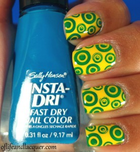
I apologize in advance for what I am about to show you. I actually think my nails look hideous which sucks because I was really looking forward to using this yellow polish. I’d like to say that I do like the yellow polish on its own, but the stamp just looks…barf-worthy. My third submission for the 31 Inspired Days of Nail Art is a big fat fail. Here we go….
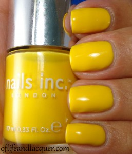
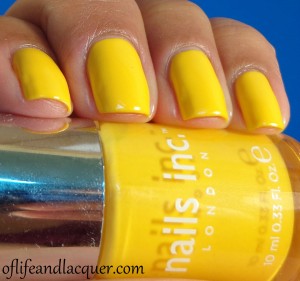
This is Nails Inc. Carnaby Street:
It’s no secret that I love Nails Inc. because they have the best creme formula on the planet as far as I’m concerned. Unfortunately, Carnaby Street fell prey to the usual trapping of yellow polish: it was patchy and kind of annoying to work with. It took 3 coats for me to be able to cover up all the bald spots which is unheard of in my Nails Inc. experience. I should have left well enough alone, but noooooooooooooooo. I had to stamp over this…
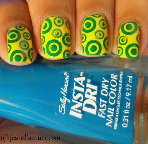
I used a design from Cheeky plate CH 48. While the design isn’t ugly, per se, the color combo just looks UGLY. Please join me in hating this final look.
I’m late to posting this because I went nuts and removed this immediately: that’s how much I hated it. I guess I can’t always have a nail win.
Don’t forget to check out the looks created by the other ladies participating in the challenge. I’m sure their submissions will be much more interesting–can’t be as ugly as mine…that’s for sure!
Thanks for stopping by and until next time!


