So I just want to preface this post by saying that I’m not really happy with today’s Stamping Saturdays offering. I think I did a sloppy job, and I go from thinking it isn’t too bad to actually hating it but I figure that I should post it anyway because not every manicure is going to be perfect. I’m feeling kind of blah today for a variety of reasons so I apologize for the lack of “pep” in this post. Let’s get right to it, shall we?
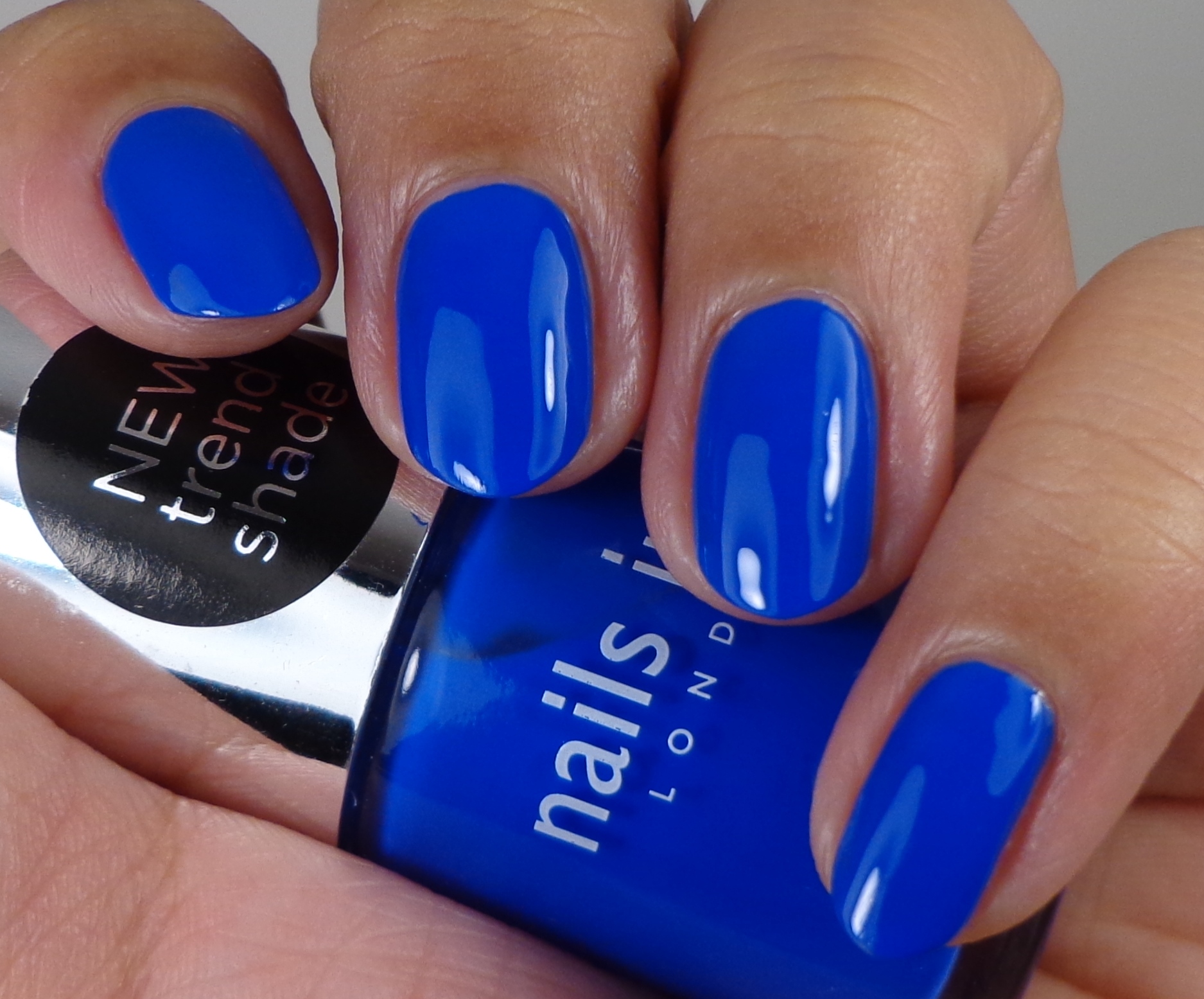
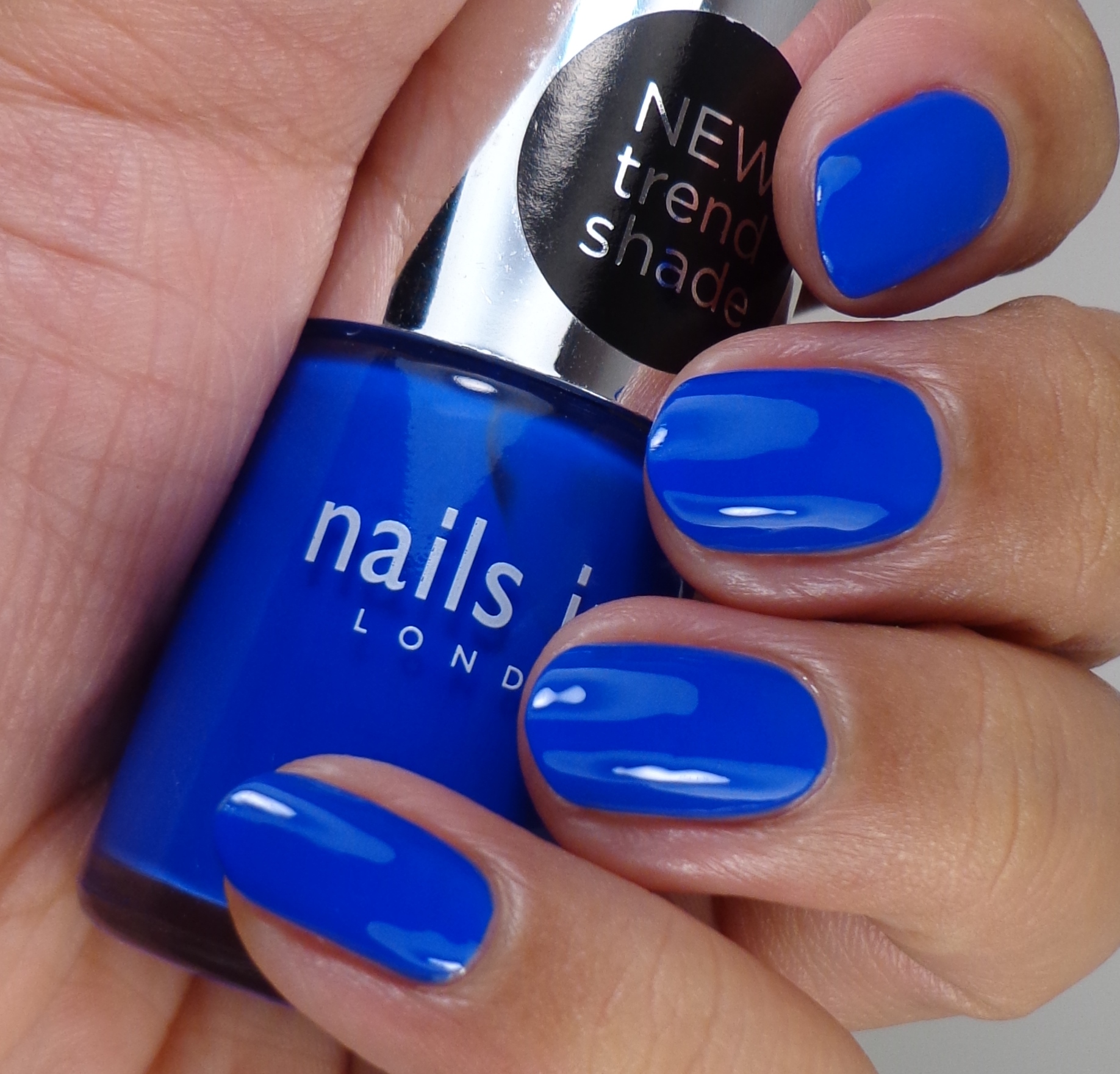 I started off with two coats of Nails Inc. Baker Street which is probably one of my favorite blues ever. This color is just so amazingly electric that I can never get enough of it.
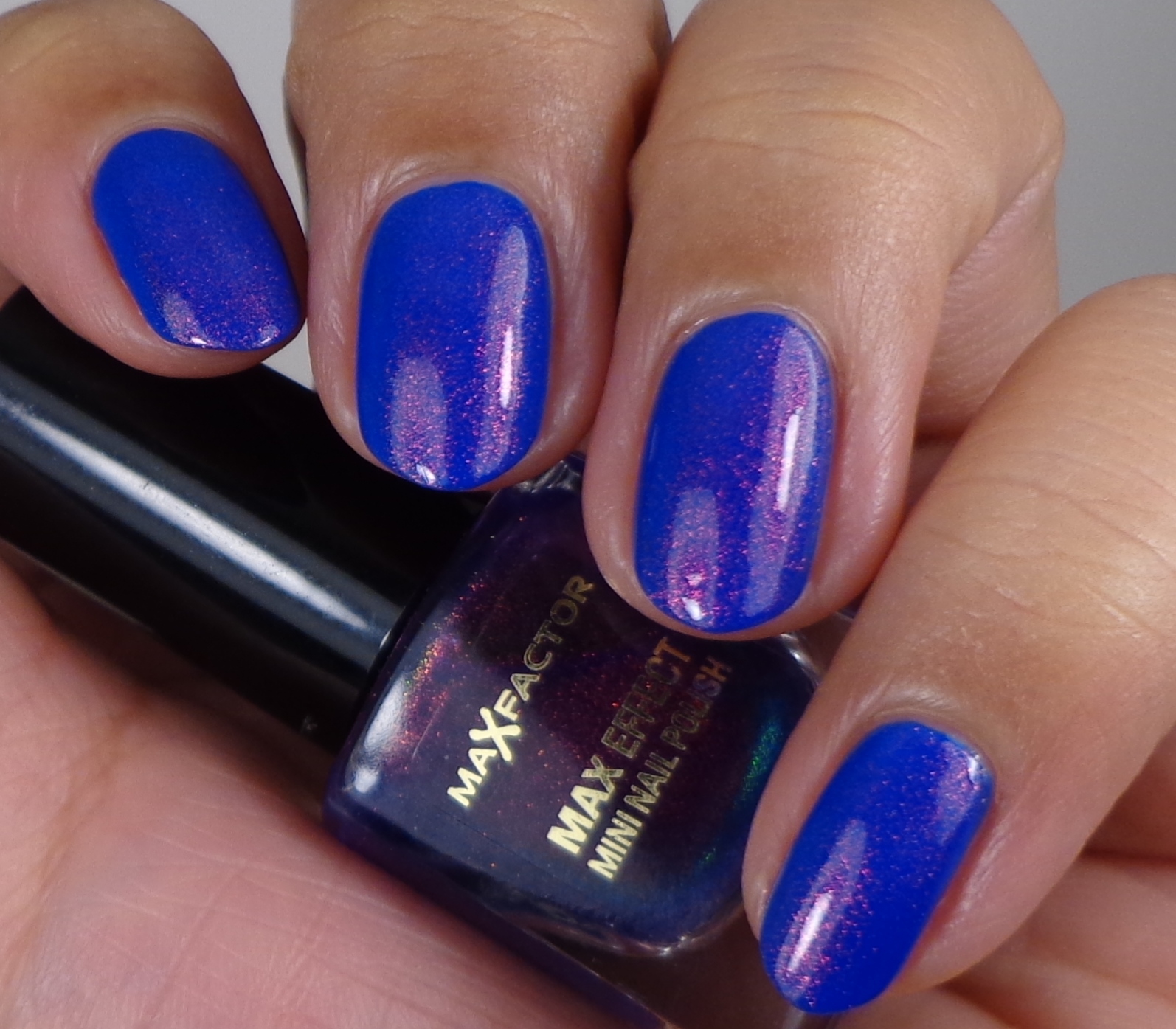
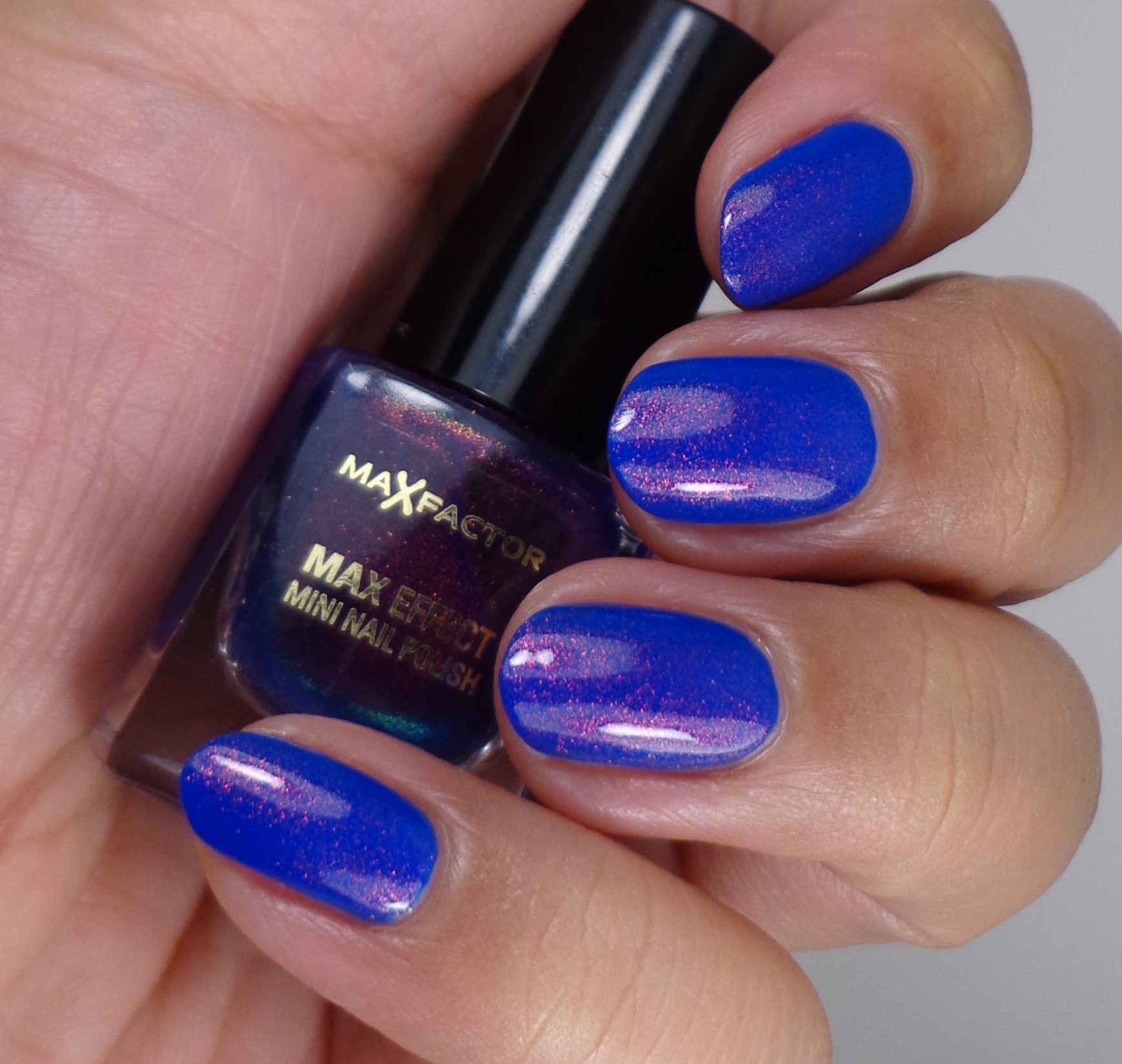 I always love to see the combination of a bright blue and Max Factor Fantasy Fire so I applied two thin coats over Baker Street.
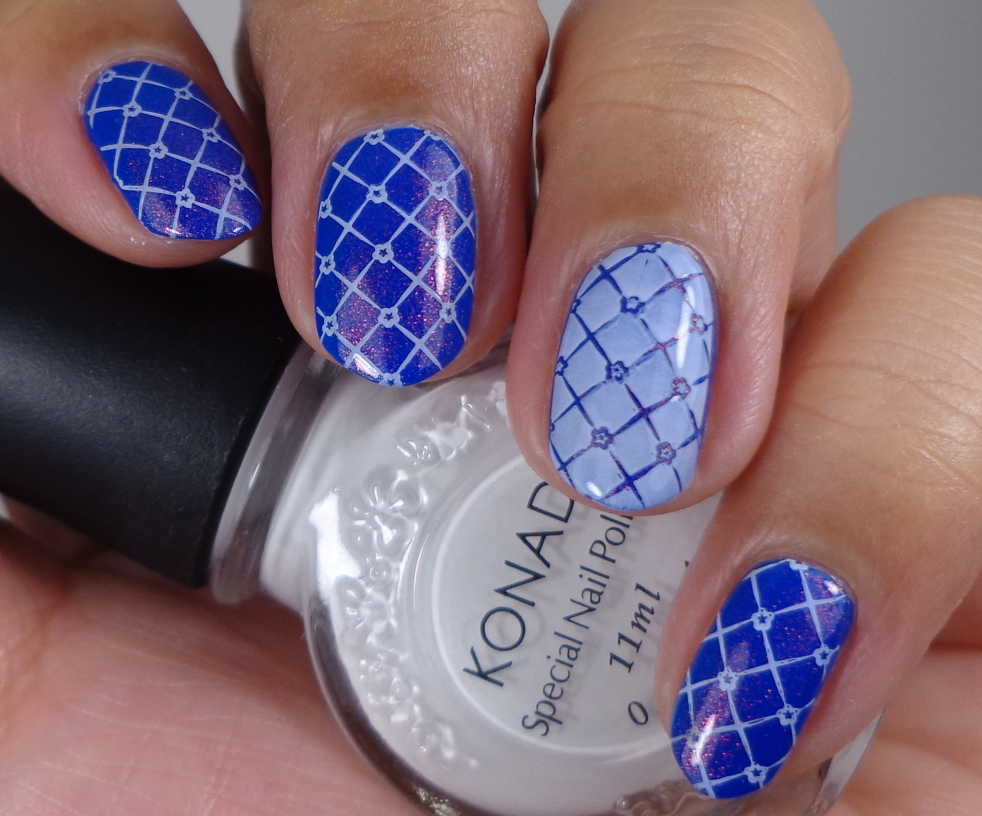
 Lastly, I used an image from Bundle Monster Plate BM 310 for my stamping design. I’ve used this image quite a few times because I love it, but I don’t think it quite works with this mani. I don’t know if it’s the color or something else, but I don’t like how this turned out. I think I’ve had a pretty good run of awesome stamping manis, so a dud was bound to happen, right?
While I was finishing up writing this post, I was watching Thelma & Louise and that final scene of their car flying off the cliff was so perfect! I love that movie! Last night I went to watch the movie Divergent and I was actually surprised that I enjoyed it. I wouldn’t say it’s a great movie, but I think it serves its purpose which is to entertain. I felt that the characters could have been a little more developed and I wanted to see more of Ashley Judd and Tony Goldwyn before they were killed…womp womp. Anywho, I’m looking forward to watching Noah next week. Are there any movies out right now that you can recommend? Let me know what you think of this week’s mani–I won’t be butt hurt if you tell me it sucks–haha! Thanks so much for stopping by today, and I will talk to you soon.
 Loading InLinkz ...
That blue is gorgeous and great stamping too!
Lisa N. recently posted..Memebox Luckybox #1 Unboxing + First Impressions
I think the reverse image is what hurts it. It’s so jarring compared to the rest of the nails. I’ve done this same thing before in previous looks and hated that one nail with the reverse image so bad. Overall I love the look though. That blue with Fantasy Fire over it is MEOW worthy.
Amy recently posted..Stamping Saturday: Gradient Stamping
I think you’re 100% right. The reverse image works in some instances like when I did yellow and black, but here it makes the whole thing look off.
I have to agree with Amy, I’m not feeling that reverse image but I love the rest. And can I just say that I adore your taste in movies!
Ashlee(PaintedNubbs) recently posted..BPS XL Stamper
Whaaaaat? As soon as I scrolled down and saw the finished mani I was like “oh my god, that’s cute!” I mean, upon further inspection, I agree with Amy, the reverse image just didn’t work here, and it’s definitely the color combination. I think that works fine when the base is a lighter color and the stamping is black or another dark color… otherwise that reverse image will wind up looking kind of odd. But I love the rest of it.
I love the colors and the stamping, I actually think it looks great. 😉 I’m watching Boondock Saints right now, and so many lines totally make me crack up.
Jessica recently posted..Orly Galaxy FX Spring 2014 collection
Spoiler alert! LOL. Love the combination of blues x
Although I agree this isn’t my favourite of your stamping designs, I still quite like it! I adore that nails inc blue though, it’s so vibrant!
Rebecca recently posted..OPI: Suzi’s Hungary Again
Jiminy Cricket, LOOK AT THAT BLUE ON YOU!!! AND THEN Fantasy Fire?!?! *falls over*
I agree with Amy that the reverse stamp is not my favorite, but the rest looks so good, who cares?
I literally did not know about Noah until last night.
I like the mani BUT the accent white nail doesn’t do it for me
I LOVE this blue I have a thing for cobalts, I love the topper and the stamp but I agree with Sib I like the other nails better than the accent white
amanda mae recently posted..Stamping Saturdays – A Sailors Oasis